
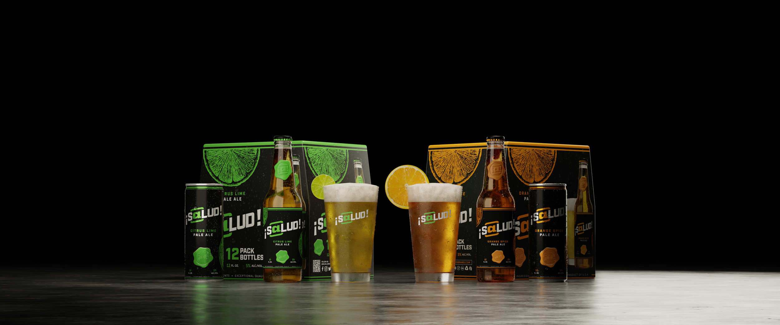
¡S@LUD! CERVEZA
Creative Direction, Product Design, Project Management, 3D Rendering, Creative Marketing
¡S@lud! is a beer brand created by Washington-based marketing agency Cre@te, a Mexican cerveza-inspired pale ale presented in two flavors: Citrus Lime and Orange Spice. ¡Salud! was devised by the agency as a case study in brand and product design, as well as a means to publicly showcase the team’s capabilities in 3D rendering, key visual design, and creative marketing.
As Project Manager, I lead the initiative on this project from start to finish and managed a team of three in the development of a brand identity and product logo, the design of the product packaging, launch of a new website, and creation of various marketing visuals and out-of-home execution concepts. I also contributed to the production of the deliverables as Creative Director and Lead Designer.
Homebrewing A Brand
For years, Cre@te has developed key visuals and marketing campaigns for multiple major global beverage companies, mastering each brand’s unique identity, history, and target consumer. This deep industry expertise has been central to the team’s strategic success. However, honoring our NDAs meant we couldn't publicly share this past work to promote ourselves. To solve this, we created ¡S@lud!, a proprietary brand built to serve as an exhibition of our agency's creative design, brand identity, and strategic marketing capabilities.
After conducting some market research and collecting examples of past work for reference, I gathered with the key stakeholders to discuss visual direction and project goals. With ¡S@lud! we sought to create a brand that could appeal to the more discerning Gen-Z beer drinker that that values craft vibes and social connections. We conceived ¡S@lud! to be a pale ale inspired by Mexican cervezas with a modern twist, with an emphasis on bold citrus flavors. This distinct brand identity directly shaped everything from our logo and packaging to our website and Instagram marketing visuals.
With a consensus on the vision for the brand, we identified all the necessary creative deliverables and composed a phased plan and work breakdown structure. I then coordinated with the team’s graphic designer Shannon Amdal on designing the logo, inspired by Cre@te’s own branding, and the logo guidelines.
¡S@lud! brand standards guide
Product Design & Rendering
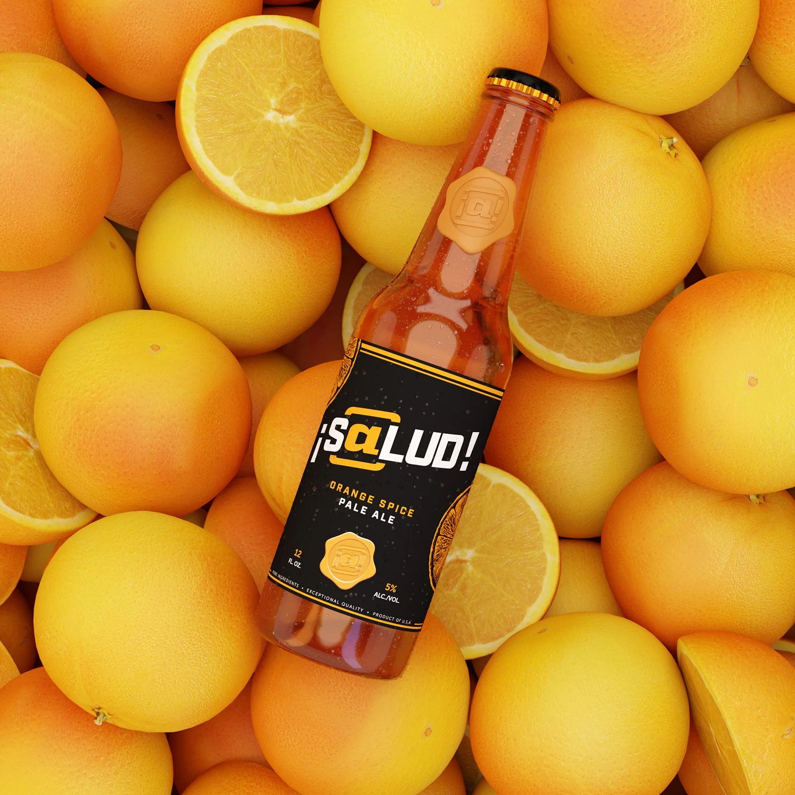
As part of ¡S@lud!’s brand identity we aimed to give the product packaging a simple modern design that looks premium but feels accessible. To that end, I drafted the bottle label, can label, and 12-pack case packaging for the flagship Citrus Lime SKU, featuring lime green accents (leveraging the same green swatch used in Cre@te’s own brand identity) that visually pop against a sleek jet black background. The label design allows for easy color swaps for different flavors, like the Orange Spice SKU, while maintaining a consistent look and feel for the overall brand. The team also came up with the idea of incorporating a wax seal as a unique brand element as a way to represent a mark or “seal” of quality.
The packaging designs were then applied to virtual models, which I staged and rendered in the 3D design application Blender. By leveraging 3D rendering, I was able to quickly produce a wide array of high-fidelity images of the packaging, including isolated product shots and some initial proof-of-concept visuals to further establish the intended visual tone for the brand.
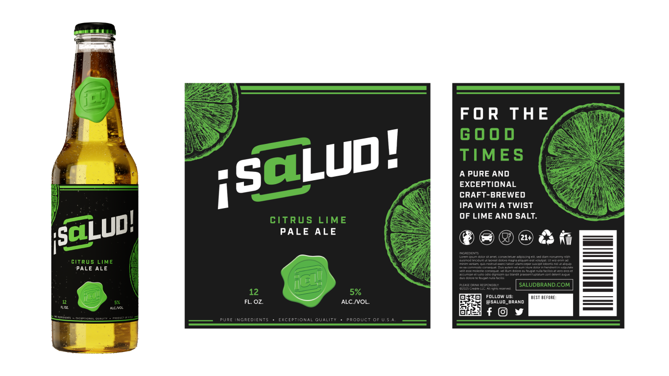
¡S@lud! 12oz bottle & label
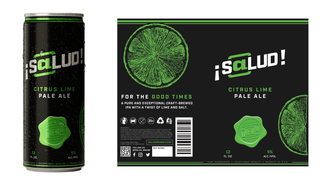
¡S@lud! 12oz slim can & label
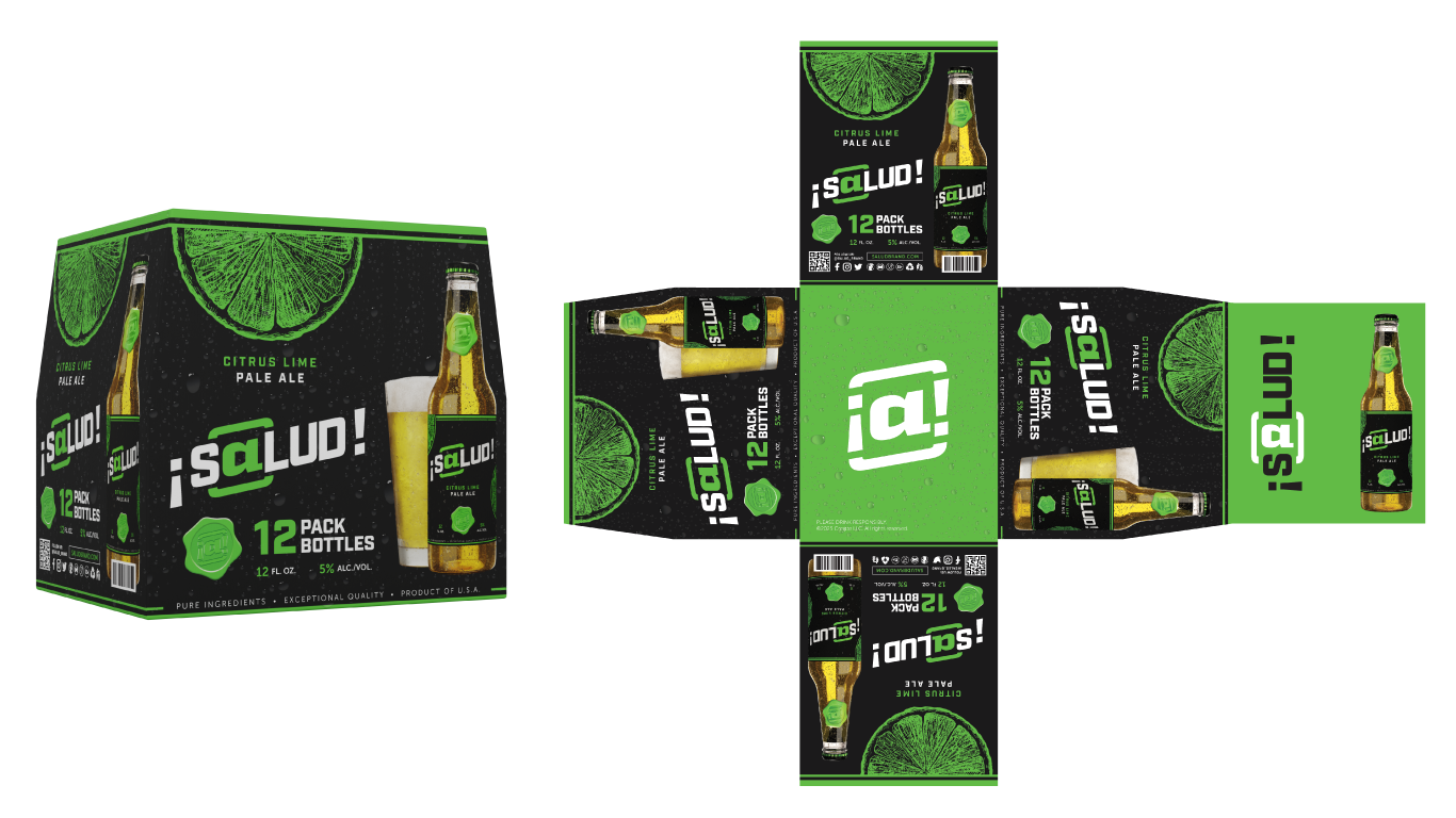
¡S@lud! 12-pack case render + layout
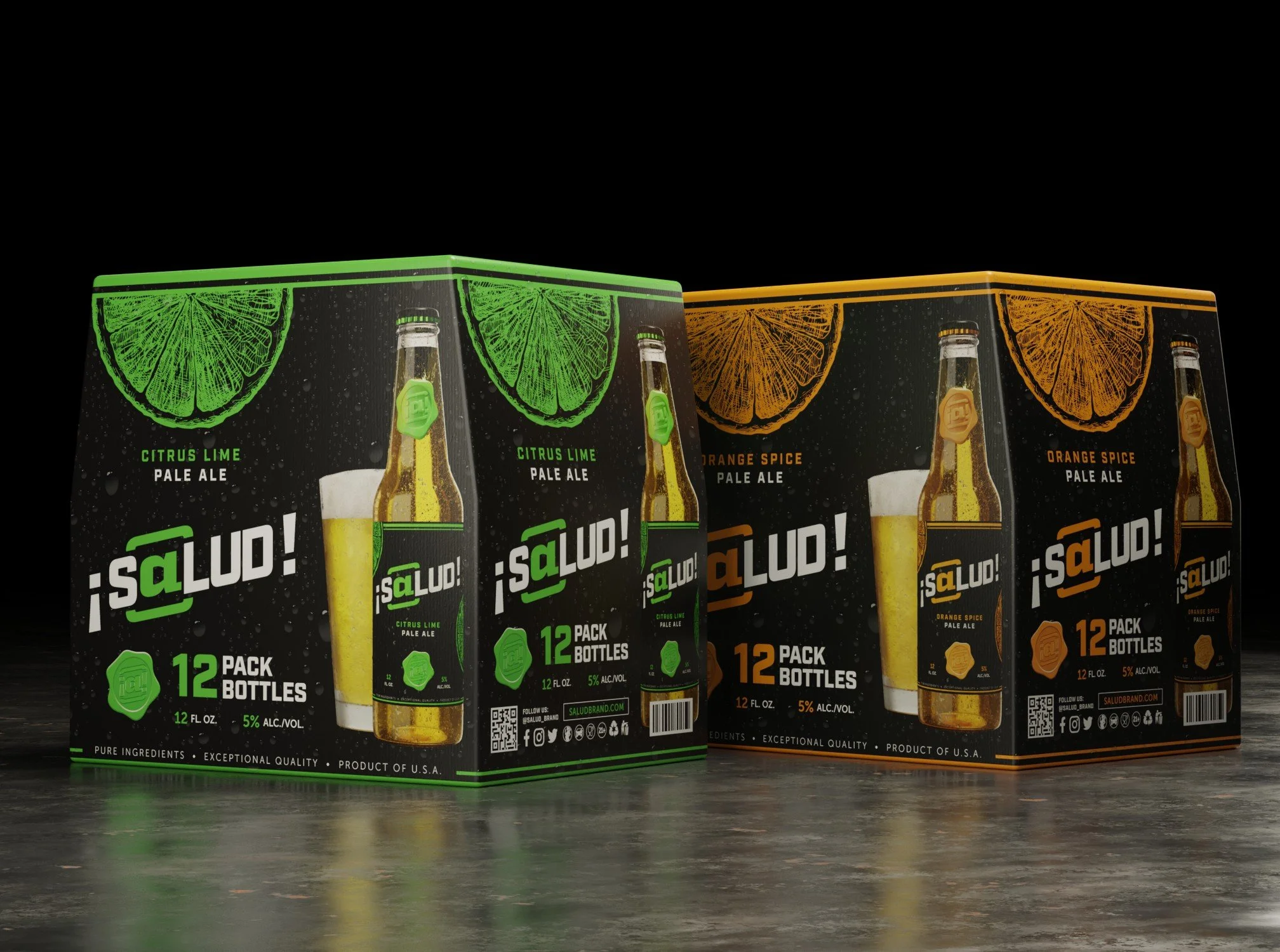
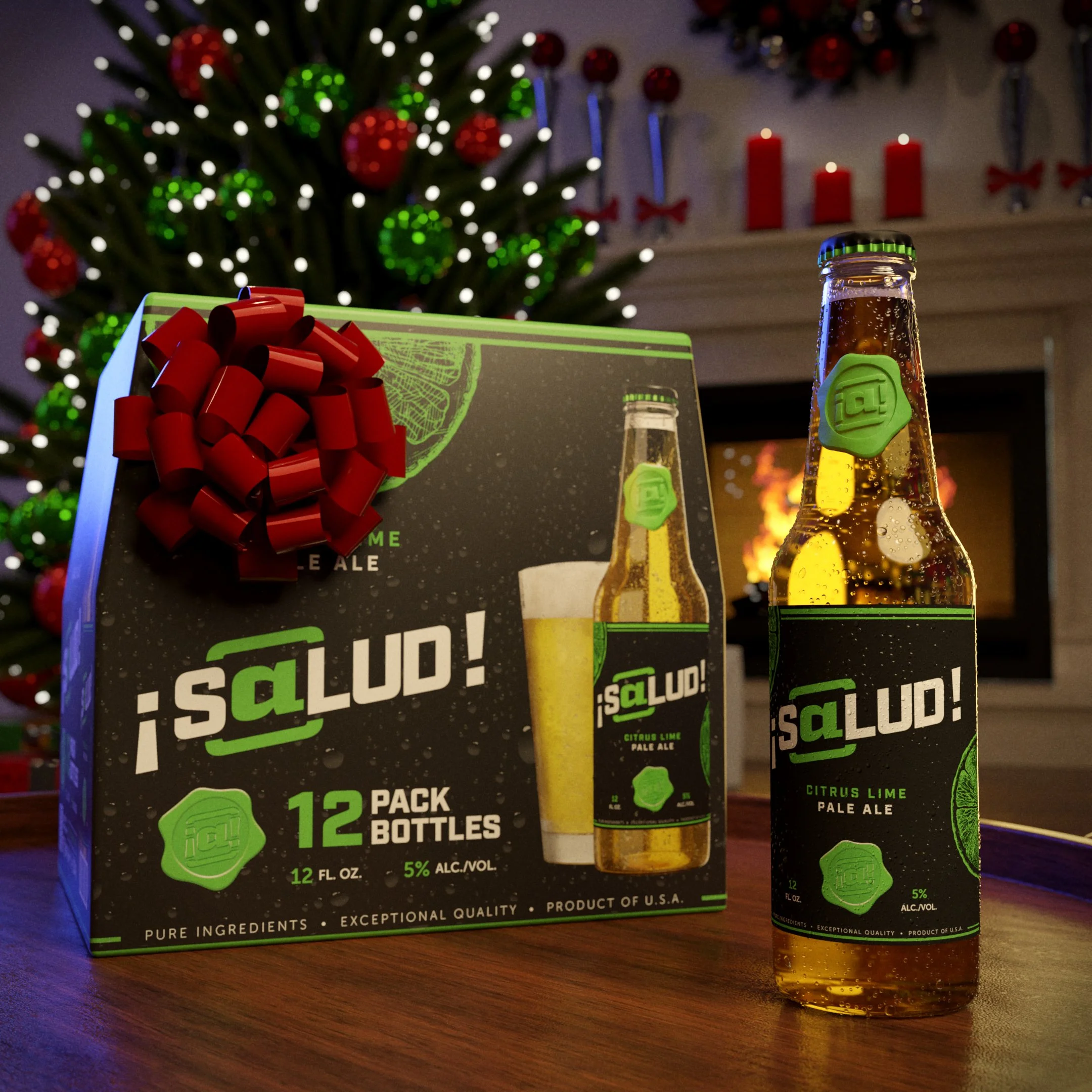
¡S@lud! 12-pack case rendering

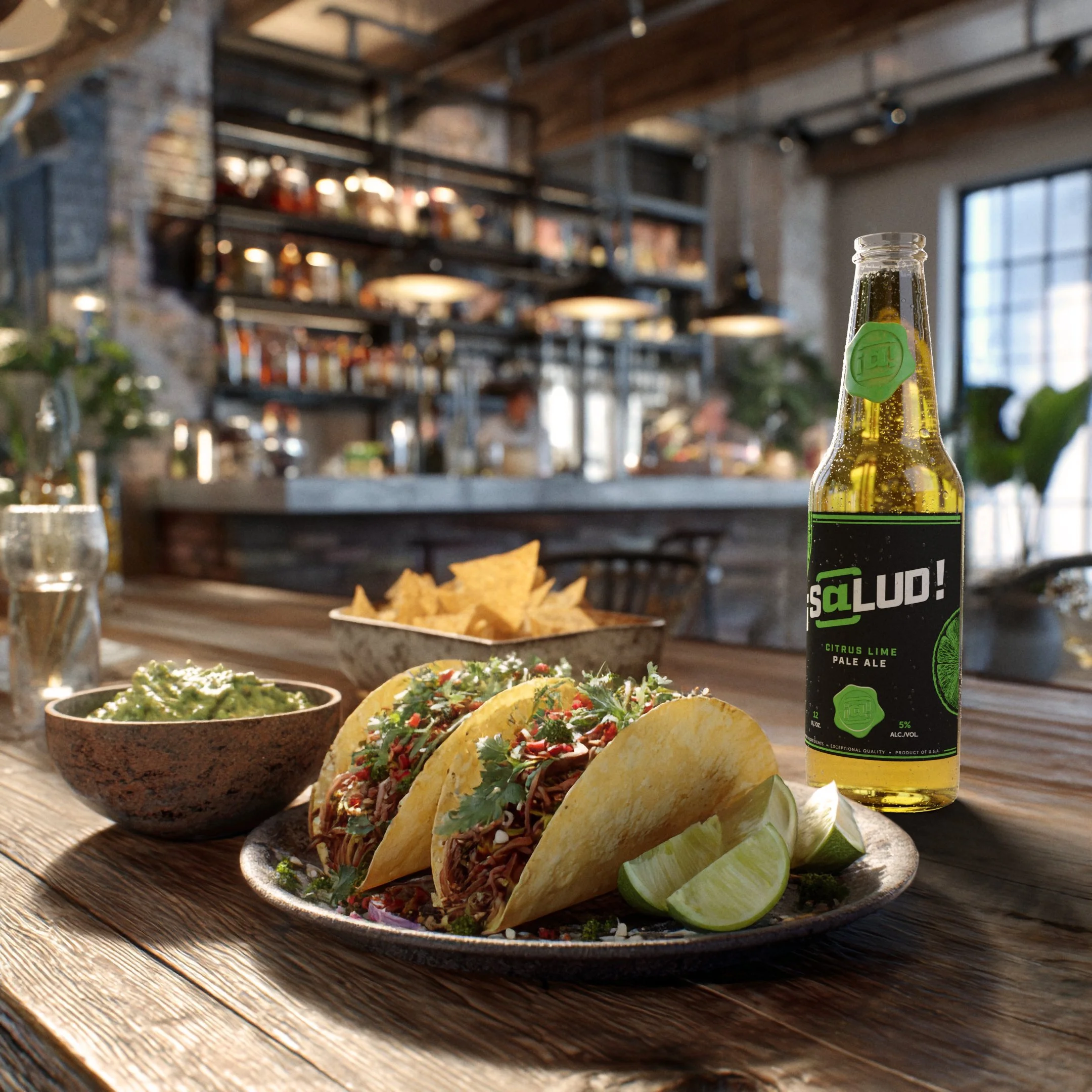
¡S@lud! Citrus Lime at the bar
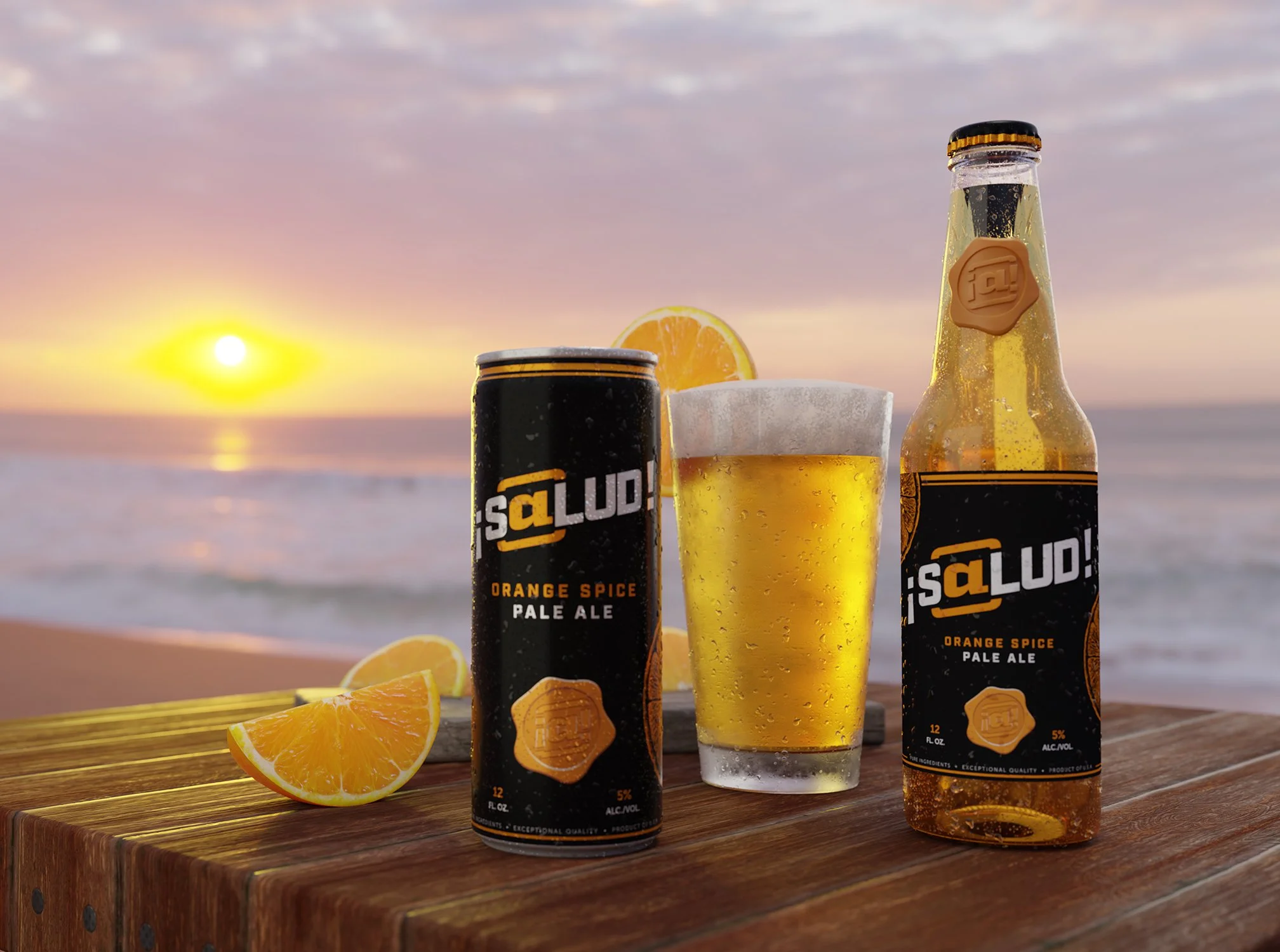
¡S@lud! Orange Spice at the beach
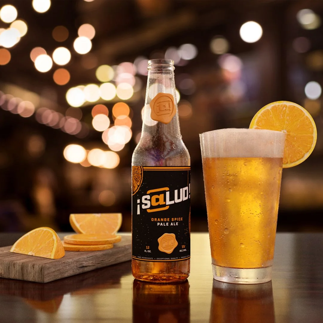
¡S@lud! Orange Spice at the bar
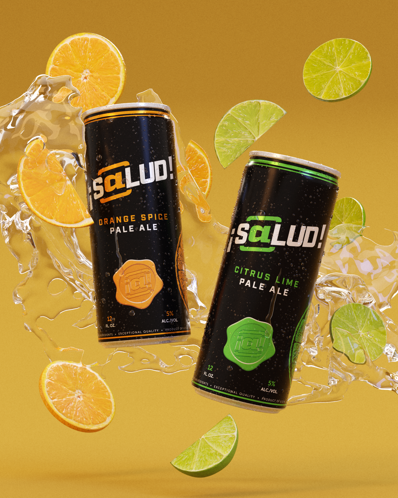
¡S@lud! can rendering
Key Visuals, Website &
OOH Marketing Strategies
Having established ¡S@lud!’s visual identity, the next phase of the project was to produce samples of marketing executions for the brand that reflect the team’s years of experience and expertise in the alcoholic beverage industry. Cre@te would then leverage these materials to advertise the agency’s creative marketing services to brand owners and consumer product retailers. The key stakeholders and I laid out plans to promote ¡S@lud! like a real existing product via social media and other channels while simultaneously running lead generation campaigns to showcase our strategies to potential new clients.
After designing a few advertising key visuals adapting my first set of 3D renderings, I coordinated with the team’s lead web developer Jeff Becker on creating a simple website for the brand. The visual direction for the website was relatively straightforward: light and easy to read, with a focus on imagery that emphasizes social moments and good times with friends and loved ones. The website itself, however, was strategically composed to appear at first glance like a regular beer brand website, but then as gradually reveal itself to the reader as case study and shift toward promoting Cre@te’s capabilities as an agency.
¡S@lud! Evergreen Soccer KV
Sipsalud.com screenshots
In addition to the key visuals, I oversaw the creation of numerous mockup images depicting a variety of out-of-home (OOH) marketing concepts for the brand. These renderings are examples of executions our team has done for clients in the past, including retail prints and displays, billboards, concession stand takeovers at public venues, semi truck trailer wraps, and more. The mockups featured below, created by me, are used by the Cre@te sales team in their lead gen campaigns, sales decks, and the agency’s website as well.
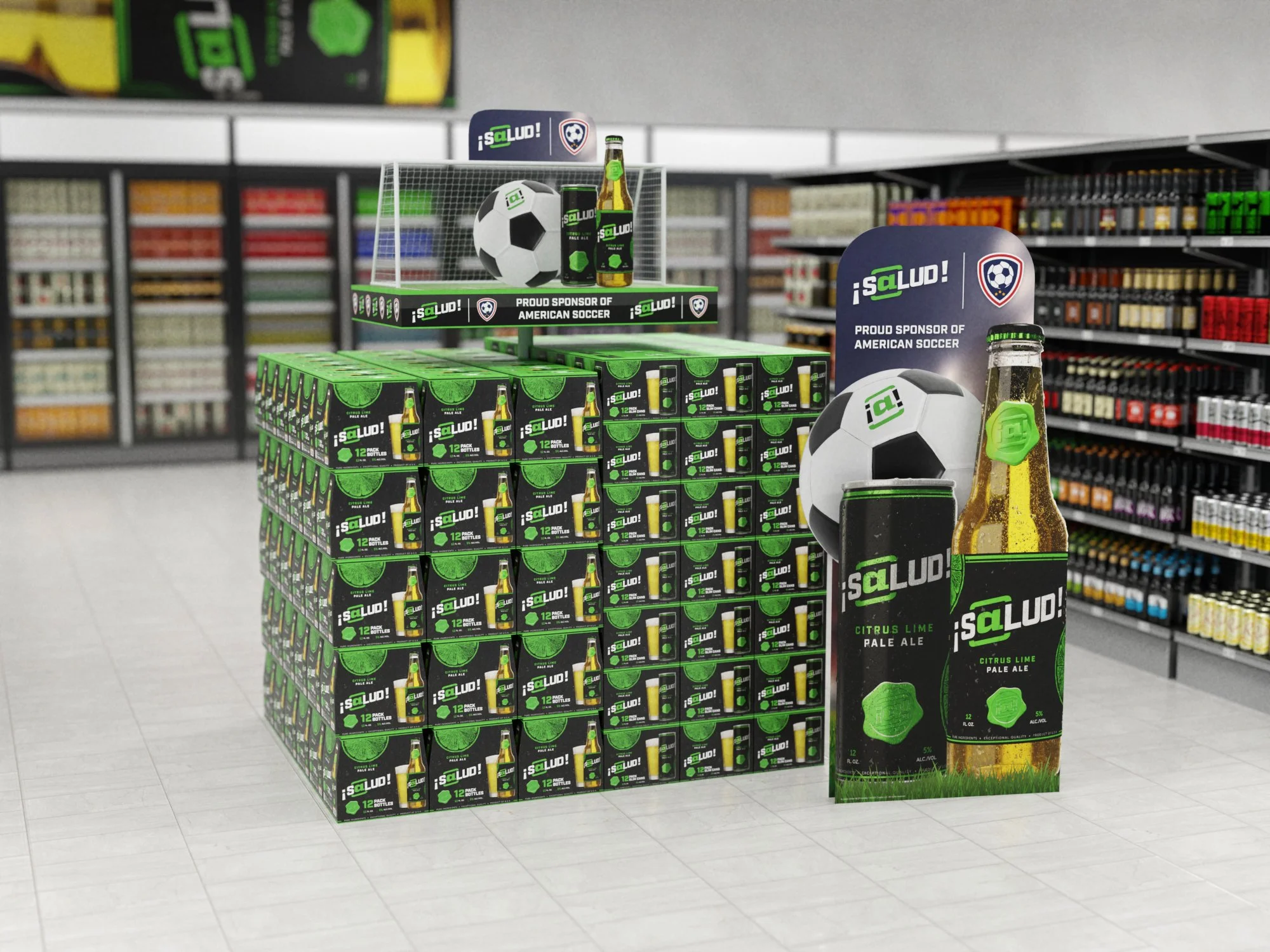
¡S@lud! retail pallet display
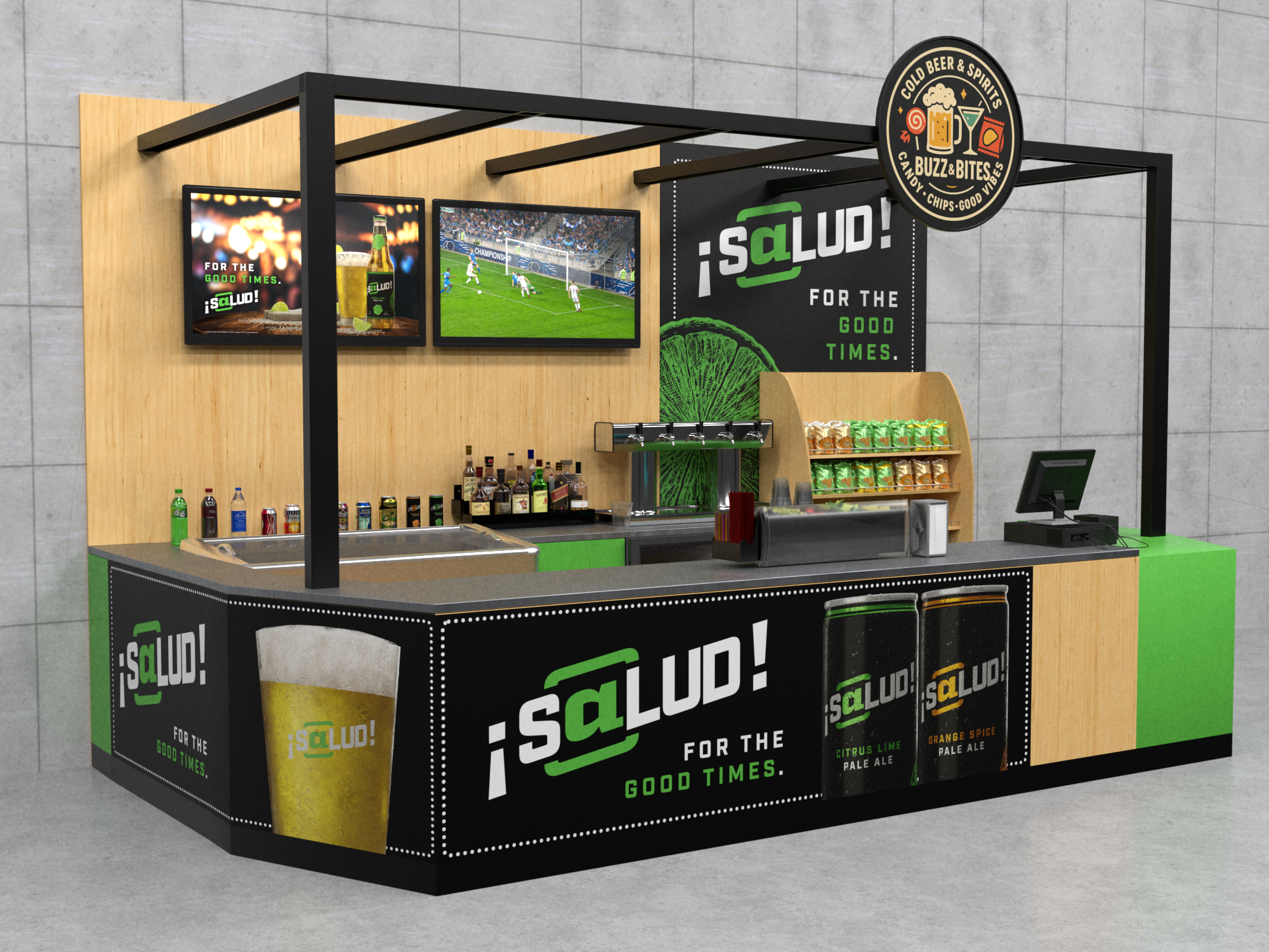
¡S@lud! concessions stand mockup
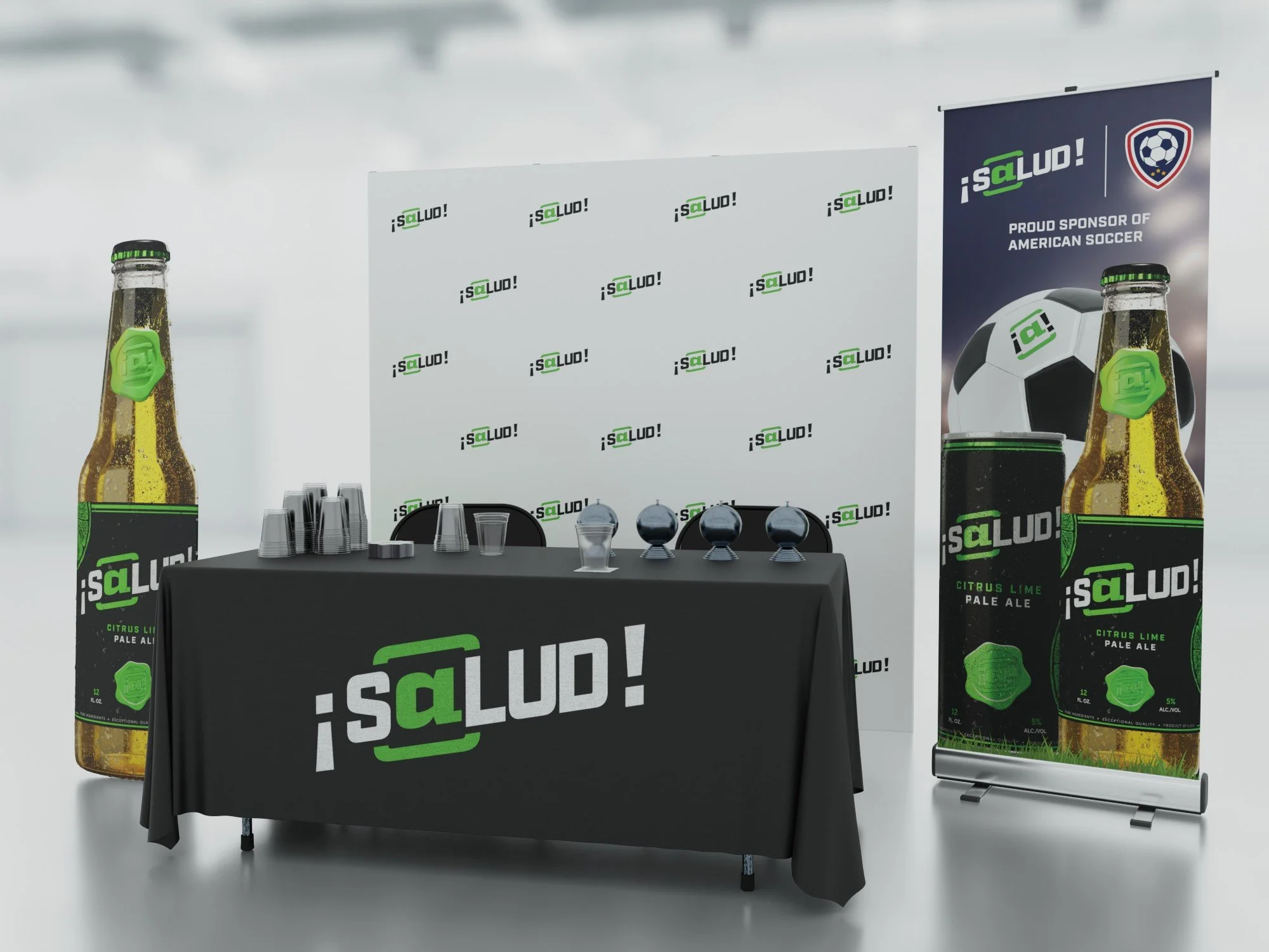
¡S@lud! trade show booth rendering
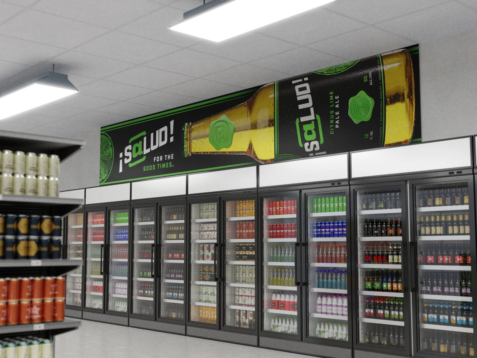
¡S@lud! OOH cooler banner mockup
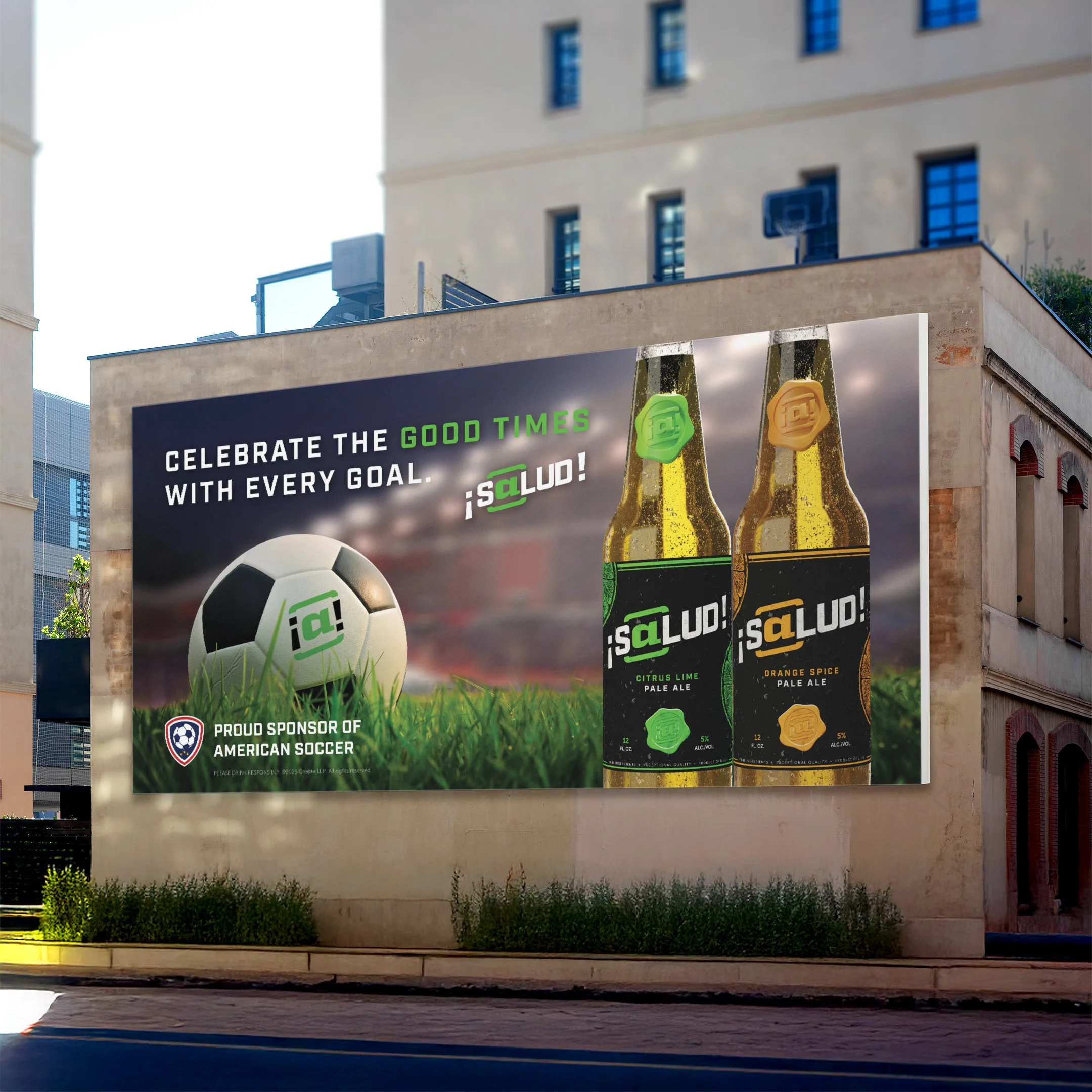
¡S@lud! OOH billboard mockup
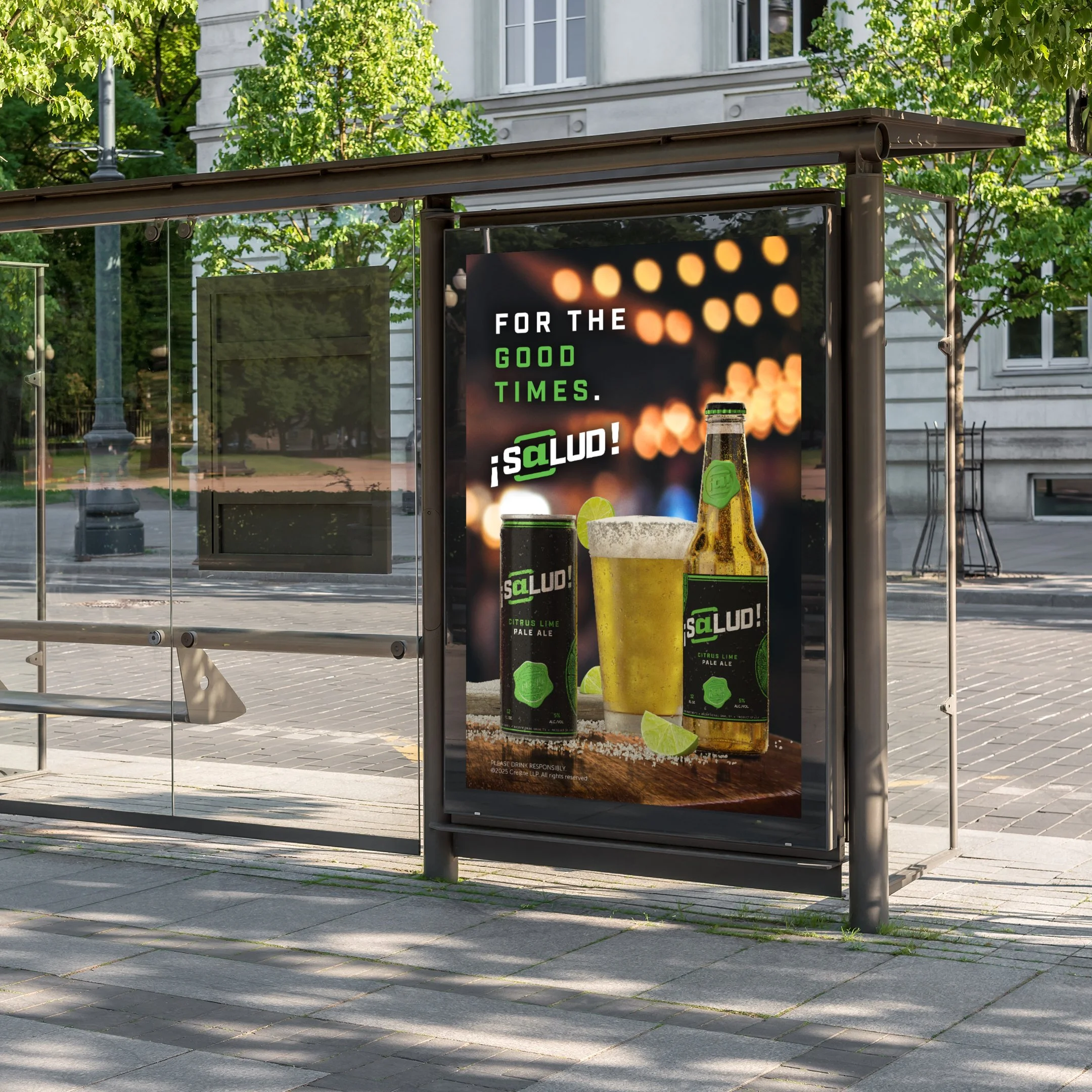
¡S@lud! OOH bus stop ad mockup
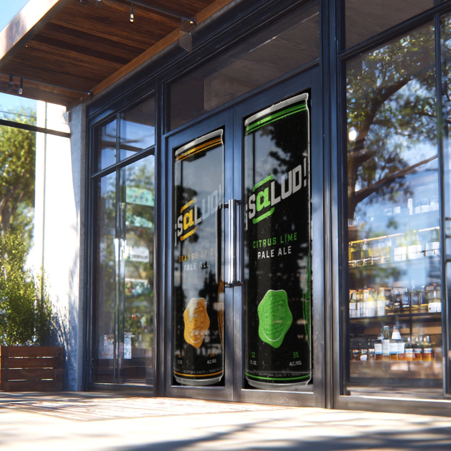
¡S@lud! window perforated print mockup
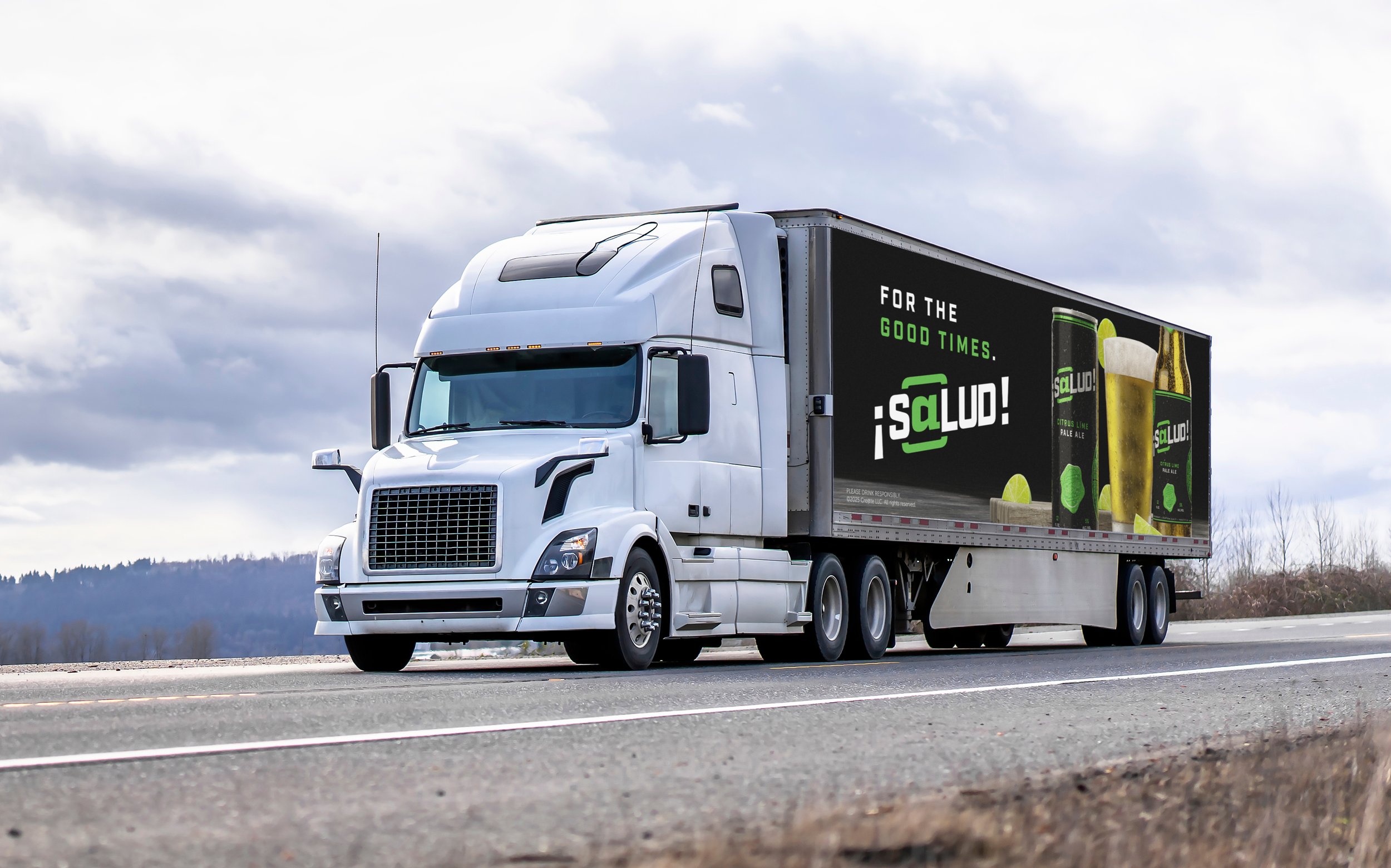
¡S@lud! semi-trailer wrap mockup
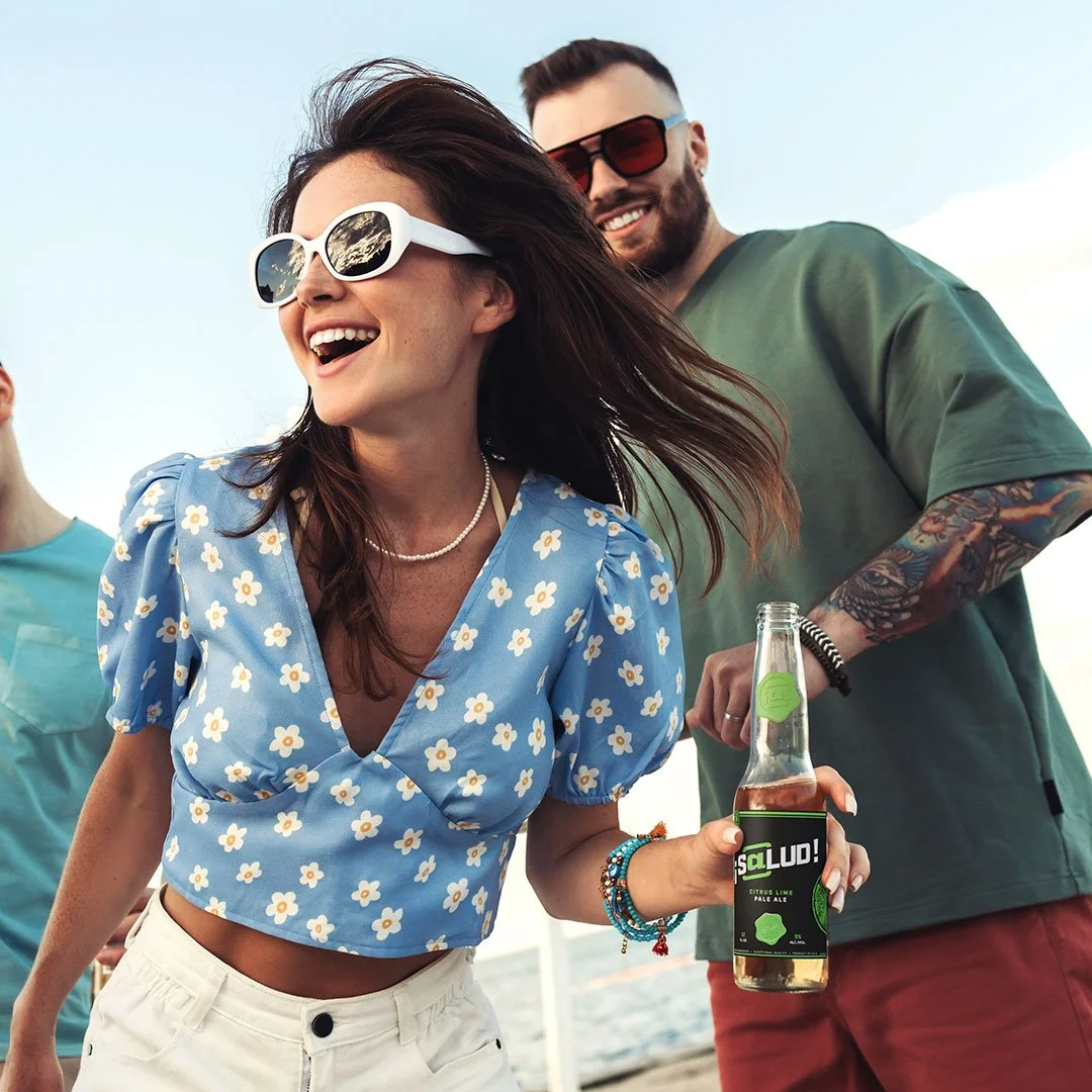
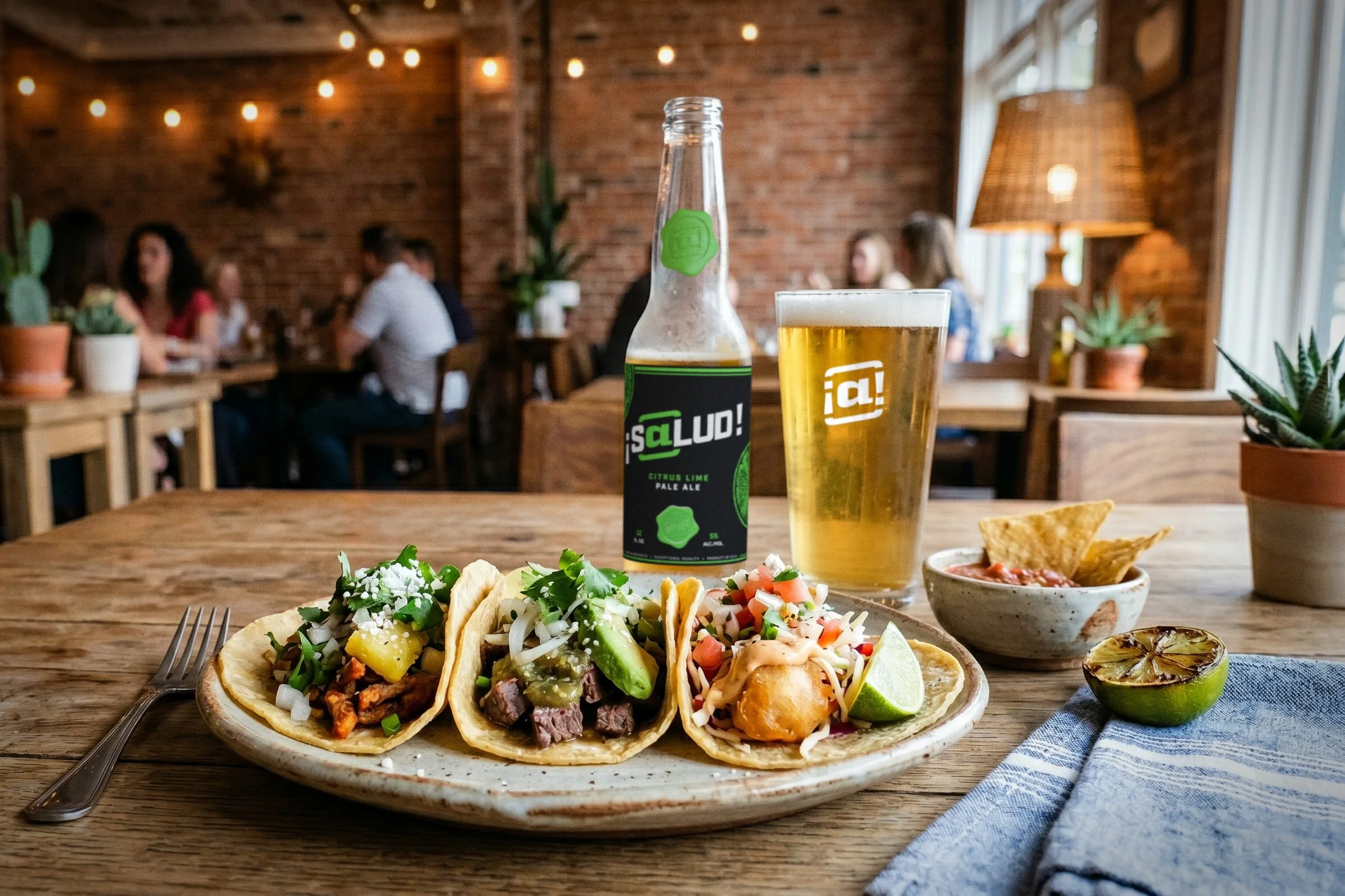
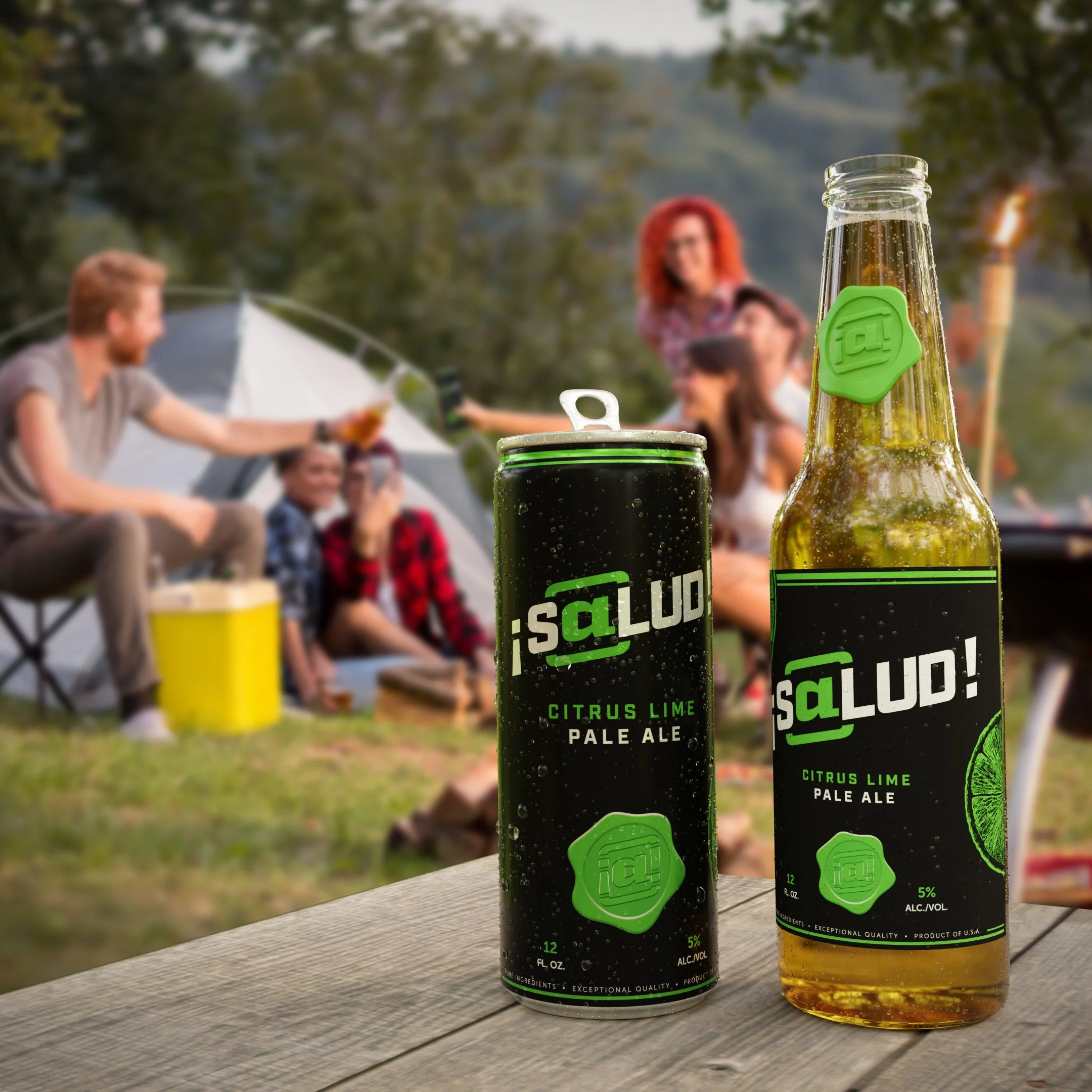
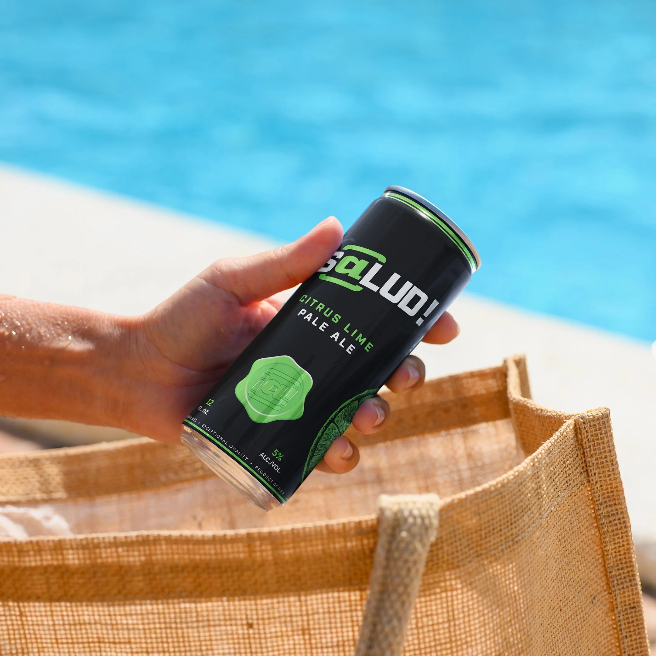
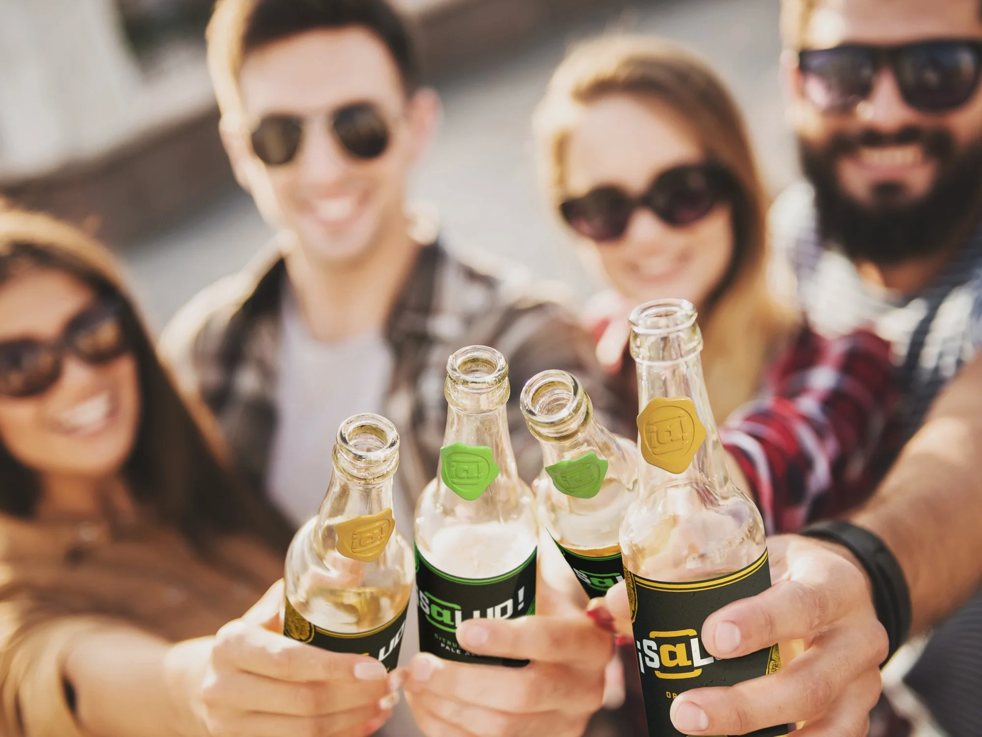
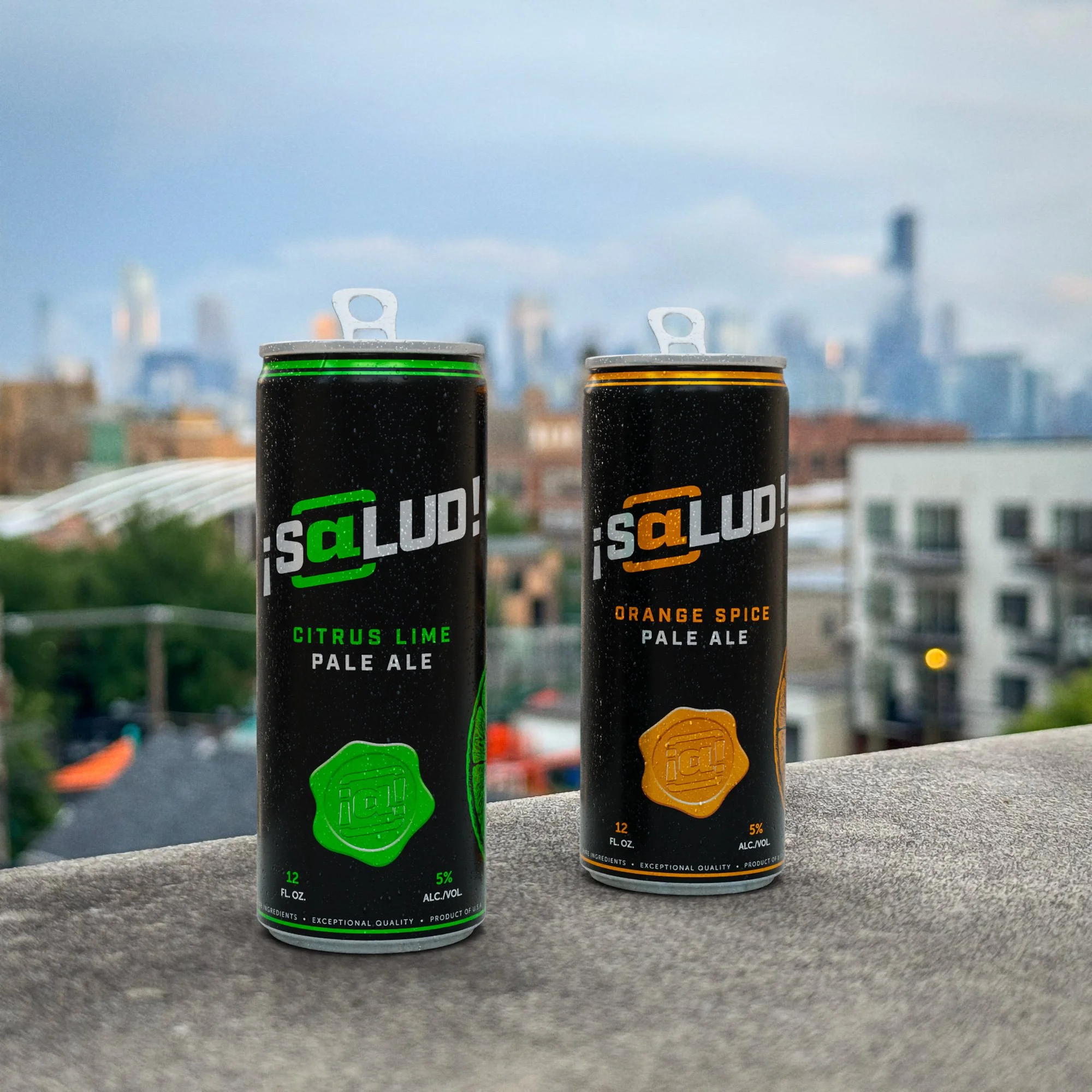
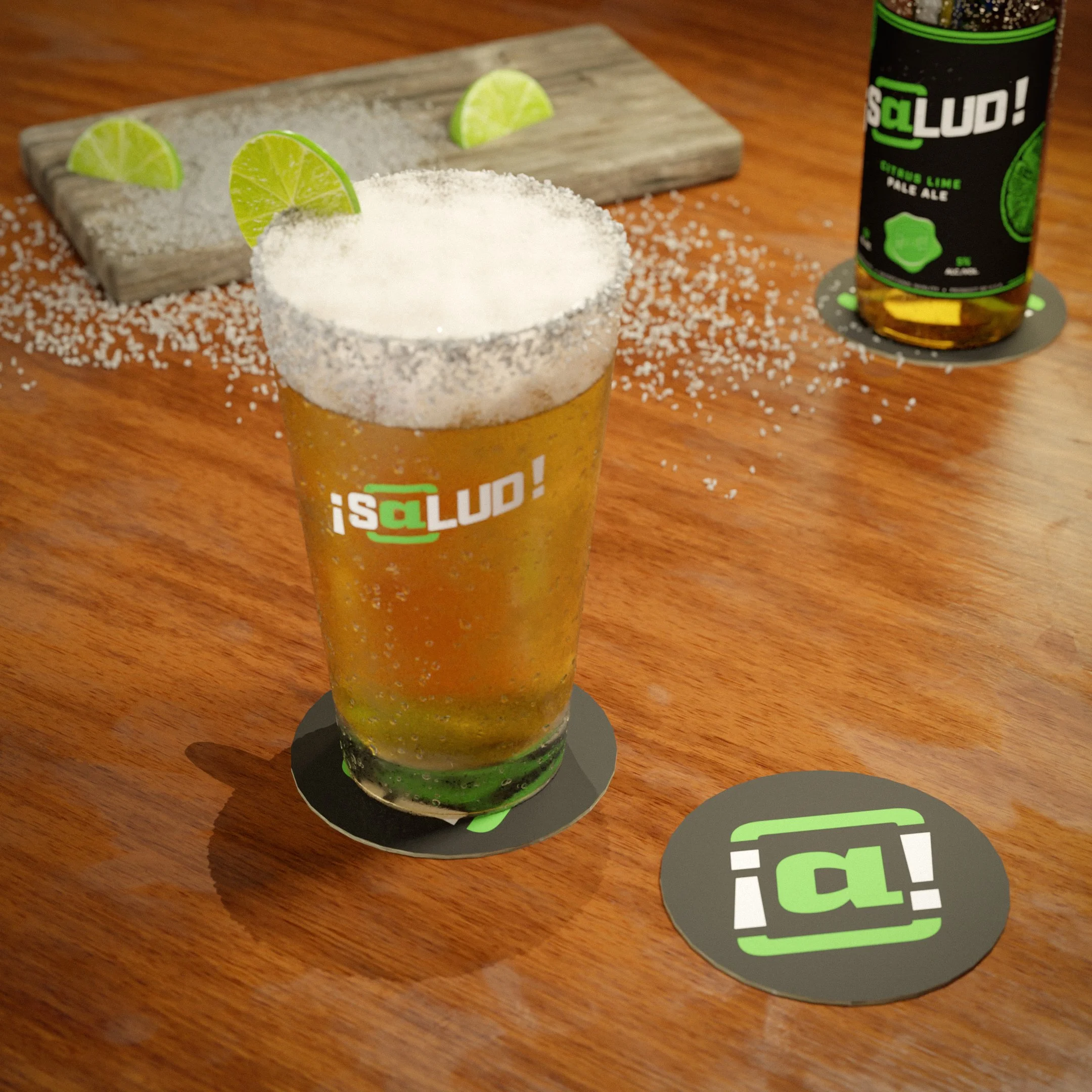
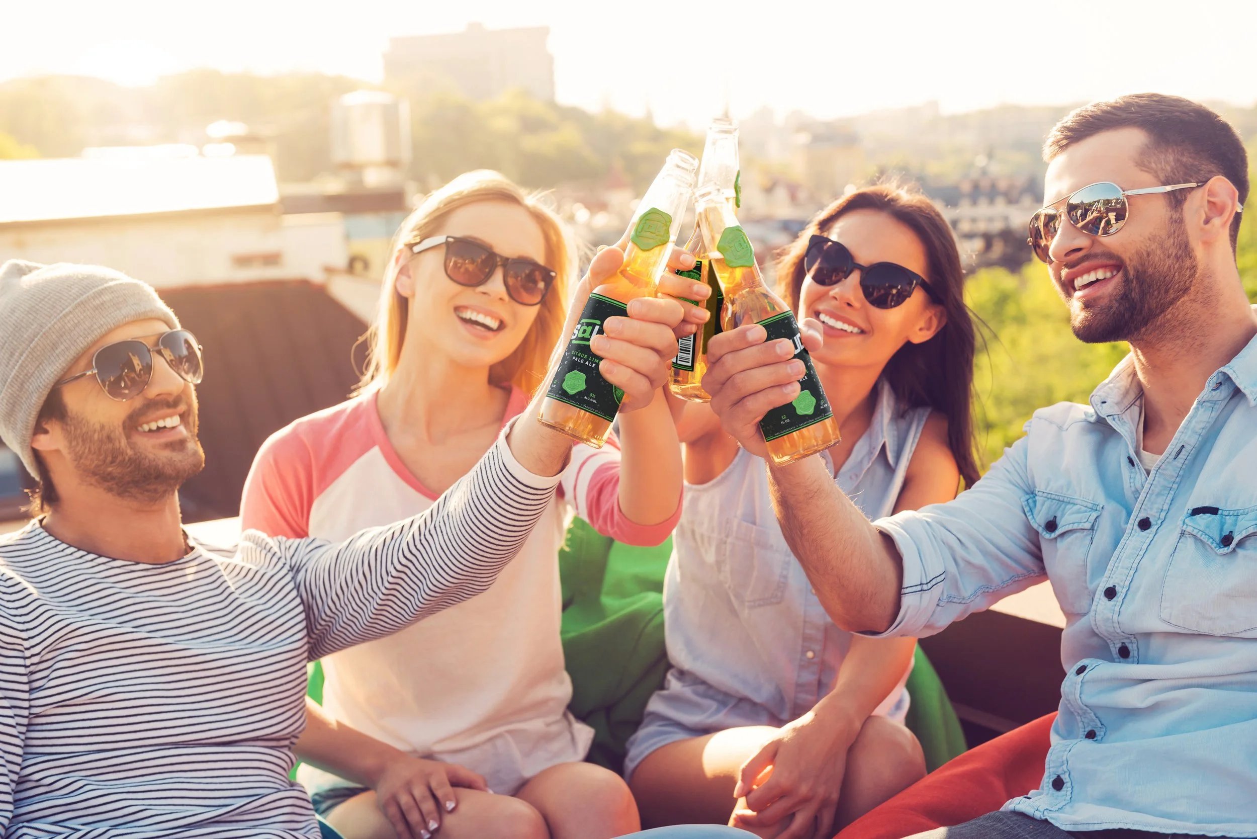
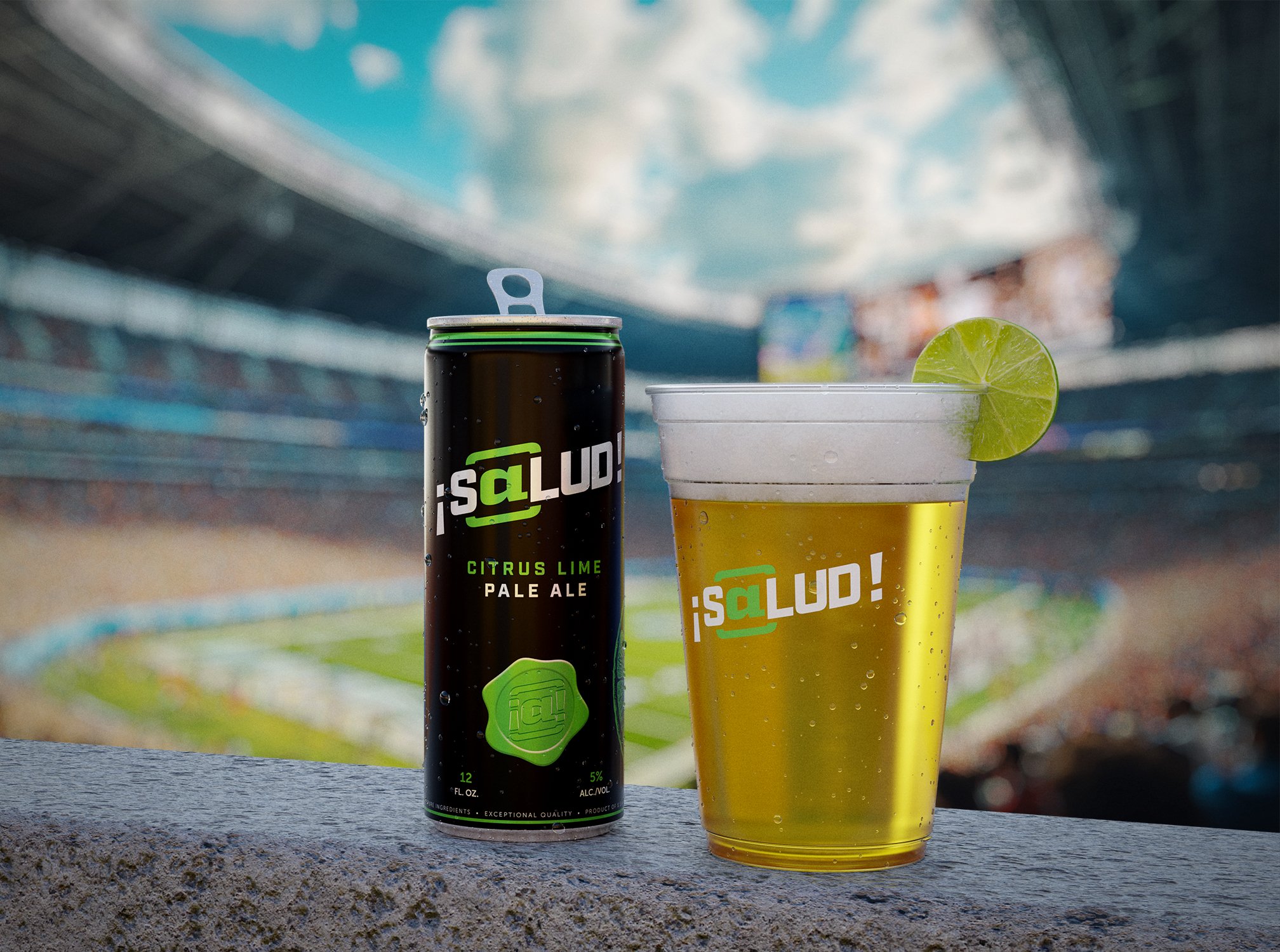
One of the more important elements of the ¡S@lud! campaign was the establishment of its social media channels. With platforms like Instagram and TikTok playing a crucial role today in building and maintaining an audience, our creative team set out to launch ¡S@lud!’s social media channels and continuously populate them with high-quality engaging content. The team and I utilized a mix of photography and 3D rendering to generate realistic-looking images of the product being enjoyed in different scenarios. Select samples created by me are featured below:
Project Results & Postmortem
The team and I held regular weekly communications to share status updates and conduct retrospectives on current or completed campaigns. We measured the effectiveness of the ¡S@lud! project through a number of metrics, including response rates on lead gen campaigns, engagements on social media, and solicited feedback on materials shared on LinkedIn. Following the data we collected on our first initial campaigns, we made some strategic adjustments and focused on more people-centric content over product-centric imagery.
The ¡S@lud! project ended up being a valuable case study for Cre@te, as it not only allowed us the freedom to experiment with different methodologies, but also provided us helpful insights on effective strategies and areas for future improvement. Overall the campaign led to a 600% increase in lead engagement with Cre@te in 2025, with a 28% increase in followers across the agency's social media channels. Cre@te also gained two new clients in the food and beverage space (a hot sauce producer and a microwave popcorn company) in the months following the campaign’s initial launch.
The ¡S@lud! brand has since become a core part of Cre@te’s own brand identity, as the agency still uses the produced content in its continued efforts to promote its services to new clients.
All images © Create-At LLP.